Favourite Fonts

Collapse
X
 
  • Time
  • Show
Clear All
new posts
  • Spenner
    Forum User
    • Nov 2006
    • 2403

    #1

    Favourite Fonts

    What are your favourite fonts and why? Assuming that you don't have to just try to fit it in with the theme of a design (i.e. just a typographic poster or something).

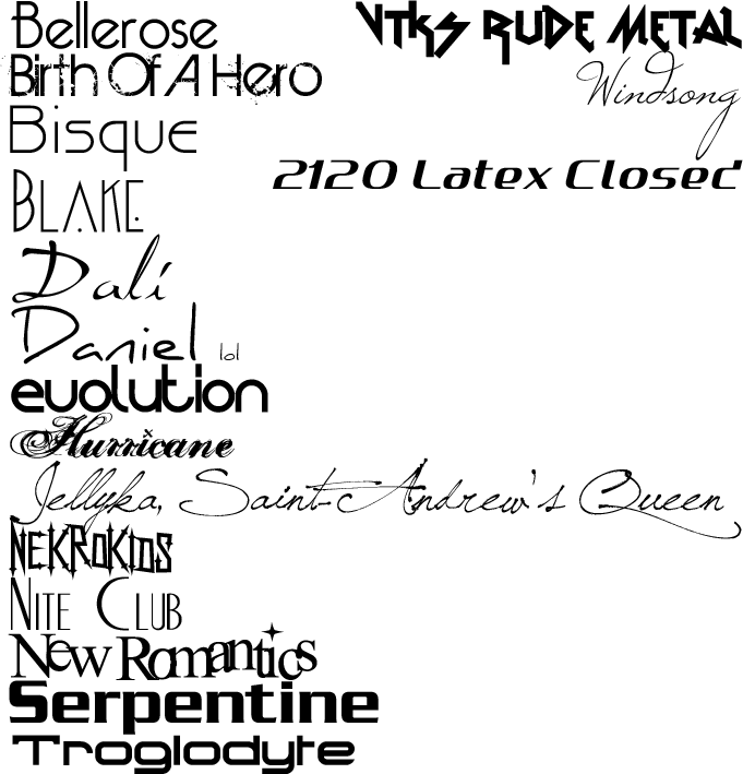
    My top ones are definitely the Aaux Pro as #1:


    I love using this one over Helvetica anyday; just has this professional digital sort of vibe to it. Definitely my go-to sans serif. Really versatile and flexible, moreso than Helvetica which is too straightforward and boring. This at least has some curvature and stands out at any size.

    For headlines and the like, I hate to really blend in with the crowd but Bebas is awesome. Really bold and impactful for lettering headings or subheads.


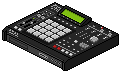
    For some specialty things with texture/a machinarium type vibe, I love the font


    I try not to use it too often, but I love when I can. Has a kind of robotic dusty/rusty element to it which makes it cool to use in a design with that kind of vibe.

    As you can tell I'm not big on serif fonts, I try to avoid them unless they're bolder ones like Nouvelle Vague:


    Watcha got in your fontbook that you like/use the most?

  • Wayward Vagabond
    Confirmed Heartbreaker
    FFR Simfile Author
    • Jul 2012
    • 5866

    #2
    Re: Favourite Fonts

    verdana all day every day i just like the way it looks like man its just feels good to look at

    Comment

    • Mourningfall
      • Jan 2011
      • 1627

      #3
      Re: Favourite Fonts

      Comic Sans MS

      Comment

      • xVaLoRx
        MYFUCKINGSOUND
        • Nov 2009
        • 1427

        #4
        Re: Favourite Fonts


        i only make cdtitles, but damn i love this font
        Last edited by xVaLoRx; 05-7-2013, 06:45 PM.

        Comment

        • NeoMasterPie
          Forum User
          • Jul 2007
          • 1405

          #5
          Re: Favourite Fonts

          I like the kawaii fonts like Helvetica, Garamond, and Futura. Non-kawaii fonts stay out of my folder ^_^

          Comment

          • Ohaider
            FFR Veteran
            • Jun 2012
            • 2893

            #6
            Re: Favourite Fonts

            Originally posted by Wayward Vagabond
            verdana all day every day i just like the way it looks like man its just feels good to look at
            Same haha


            Harabara looks really cool

            Comment

            • Gundam-Dude
              `~`
              FFR Simfile Author
              • Oct 2005
              • 7327

              #7
              Re: Favourite Fonts

              I have countless favourites, but I made a few selections below—this is the one and only time I'm ever doing this.


              A few of them are some of my advanced typography prof's favourites—in the past, he worked at Monotype Corp. drawing and designing several typefaces that most of us have on our machines today. But of course, there are a couple personal favourites of mine that he absolutely detests as an anal-retentive typographer, lmao. For example, he stated that: "Gotham is the Arial of geometric sans-serifs, stop using it."

              P.S. I fucking absolutely hate Helvetica with a passion.


              (Download My Magnum Opus, Solo Kpop Pack!)

              My Simfiles (4key & 6key)

              Comment

              • Arntonach
                Owlbears Rock!
                • Mar 2012
                • 2494

                #8
                Re: Favourite Fonts

                You typography people are creepy.

                Anyways, my favourite fonts are:
                pack of hard stuffs

                pack of my stuffs

                Comment

                • wwplpmpn
                  FFR Player
                  • May 2011
                  • 279

                  #9
                  Re: Favourite Fonts

                  Originally posted by Gundam-Dude
                  "gotham is the arial of geometric sans-serifs, stop using it."
                  Originally posted by Gundam-Dude
                  p.s. I fucking absolutely hate helvetica with a passion.

                  Comment

                  • Sweet Angel
                    \(o.o)/ ~(e.e)~
                    • Apr 2012
                    • 620

                    #10
                    Re: Favourite Fonts

                    Originally posted by Arntonach
                    You typography people are creepy.

                    Anyways, my favourite fonts are:
                    I'd have to agree here. I love all these fonts *-*

                    8th Official - Top 209th Official - Top 16


                    Comment

                    • noname219
                      FFR Wiki Admin
                      • May 2007
                      • 1694

                      #11
                      Re: Favourite Fonts

                      I'm usually very careful when choosing a decorative font, I feel they distract a lot and they are harder to read. Some of them are way too overused (ex : Bleeding Cowboys - I freaking hate that one). They have a very limited use so I don't really use them very much.

                      I always try to chose a different font every time, but some I like are Copperplate, Baskerville, Myriad Pro, Trebuchet, Calibri + some more that were listed before me. Vermin Vibes is a pretty cool one I used in a past project.

                      If you're looking for some new fonts to use, check this list. e: and this one too!
                      Last edited by noname219; 05-7-2013, 11:20 PM.

                      Comment

                      • JohnRedWolf87
                        Backlogger of Hobbies
                        • Dec 2007
                        • 968

                        #12
                        Re: Favourite Fonts

                        Times New Roman.

                        xBBx Takedown's First Tournament - 2nd Place (Beginner)
                        ZC_Wolfy's Birthday Tournament - 3rd Place (Novice)
                        Dragons_Fury One Division Higher Tourney - 2nd Place (Novice)
                        Samurai7694's Ultimate Enduring Fabulous Tournament - 3rd Place (D1)
                        Dark_Chrysalis' 1st FFR Bowl - 2nd Place (D1), 13th place overall
                        Panic4Me and MrMagic's Thanksgiving Tournament - 2nd Place (D1)

                        Comment

                        • Razor
                          Dan "Razor" Devilz
                          FFR Simfile Author
                          • May 2004
                          • 1606

                          #13
                          Re: Favourite Fonts

                          small list of some of my favorites

                          Originally posted by FFR Forum Awards
                          Best FFR file from 2013:
                          3rd: Retro City
                          Originally posted by Choofers
                          I play Stepmania, so I know everything about media formats.

                          Comment

                          • Coolboyrulez0
                            VICES
                            FFR Simfile Author
                            FFR Music Producer
                            • Aug 2006
                            • 10042

                            #14
                            Re: Favourite Fonts

                            Impact.

                            Bold.
                            https://soundcloud.com/cbrbreakcore
                            https://cbrrecords.bandcamp.com/

                            Comment

                            • Spenner
                              Forum User
                              • Nov 2006
                              • 2403

                              #15
                              Re: Favourite Fonts

                              Originally posted by Sweet Angel
                              I'd have to agree here. I love all these fonts *-*
                              Blegh, I think they're awful

                              I feel like they're something I'd only use once ever, to suit a certain style for a header of a magazine ad or something like that. Bisque and Serpentine are the only ones I'm fond of from there. I'm pretty picky though.

                              I really love that Geogrotesque one Gundam Dude; I must say though, I REALLY dislike some of the fonts like Franklin Gothic, Eurostile, Trade Gothic, and especially Verdana.

                              On ever "r", "n, and some other ones, just how the curved forms come to a pinch as they attach to the verticals. If that makes sense-- they all seem so unclean because of that feature. But that's a bit of a personal taste-- to me it looks choppy. I prefer more solid curves that don't slowly taper down in thickness as it attaches to the vertical bars of the forms. If I had a really clean design with grids and squares and all that, I feel like I wouldn't be able to use any of those, would feel too out of character. IMO all depends what you're using it for and how you use it too.

                              I'm happy to see no Bleeding Cowboys so far @__@
                              Last edited by Spenner; 05-8-2013, 09:58 AM.

                              Comment

                              Working...