Rap music is music. However, It's not in the traditional sense of how we understand music. The vocals are filled with slangs that gangs used since the 70s and a lot of the instrumentations are replaced with "Street Sounds" instead of traditional instruments. Music is defined as any combination of sounds that is pleasing to the ear, so while one person may find it as "noise" another person can find it pleasing to the ear and so call "vibe" with it as how I think the kids would say it these days.
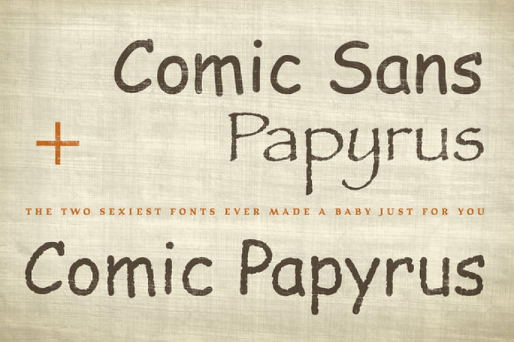
Just to add onto this, the fact of the matter is that a very large majority of grunge typefaces all use a pre-existing cut/design, usually from something considered "classic." Another example is Birth of a Hero where ITC Avant Garde is used as the base before the guy literally shits on top of it. Frankly, all of this guy's work is the same.
God damn, all those fonts that guy made all look absolutely awful.
I'm not much of a typography person, but I would THINK the first priority of creating a typeface of any kind would be to make it GOD DAMN LEGIBLE
Like... what even are those fonts in that link? Jesus F-en F.
Originally posted by JohnRedWolf87
Charu the red-nosed Snivy
Had a very shiny nose
And if you ever saw it
You could even say it glows
All of the other Snivies
Used to laugh and call him names
They never let poor Charu
Join in any Snivy games
(Click the arrow to see the rest)
Originally posted by Vendetta21
All in all I would say that Charu not only won this game, his play made me reconsider how I play it.
They are such overused fonts though too. Super tacky; those kinds of fonts turned me off so much that I have to custom texture any font I want to have that grunge font, to fit a unique design. It cannot look like someone else's brush fucked font.
Also it's pretty basic but I like Aaux Pro. And geogrotesque.
the real question is how many of you font elitists are the same people who would needlessly insert colors, guidelines, or stupid shapes into visual data display
Rap music is music. However, It's not in the traditional sense of how we understand music. The vocals are filled with slangs that gangs used since the 70s and a lot of the instrumentations are replaced with "Street Sounds" instead of traditional instruments. Music is defined as any combination of sounds that is pleasing to the ear, so while one person may find it as "noise" another person can find it pleasing to the ear and so call "vibe" with it as how I think the kids would say it these days.
Please don't use Gill Sans.
The R makes me sad. The Q and p aren't nice either.
What's your opinion of Frutiger, Syntax, and Bliss? All three of these fall under the same sans-serif classification of being Humanist Sans, with slightly different variations between American and European designs.
The thing with Humanist Sans typefaces is that the uppercase proportions are derived from Roman capital letters, meanwhile the lowercase have a distinct design to mimic the feel of human handwriting and calligraphy. Humanist Sans weren't really an innovation in terms of a classification itself, but more that it became a stabilizing form of sans serif to be used for sign making / sign writing specifically. It was what really introduced a basic monoline "block" letter based upon classical roman proportions, which had not been previously done before in the form of traditional metal type and casting.
With that being said, Gill Sans was originally designed as a display face for signage, before its popularity in usage lead to its adoption as a text typeface. Although it doesn't necessarily look appealing as a text face, there's no doubt that Gill Sans' popularity is attributed to its absolute clarity as a display face. Also to note, Neo-Grotesque sans-serif typefaces like Helvetica and Univers weren't designed until the 1950s, meanwhile Gill Sans was designed in the late 1920s. In short, you can attribute the entirety of monoline "block" letters to Gill Sans' creation because without it, you wouldn't have Helvetica's monotonous letterforms. The more you know.
P.S. Helvetica is the pinnacle of boring. It's admittedly nice, but it's the most basic bitch font.


Comment