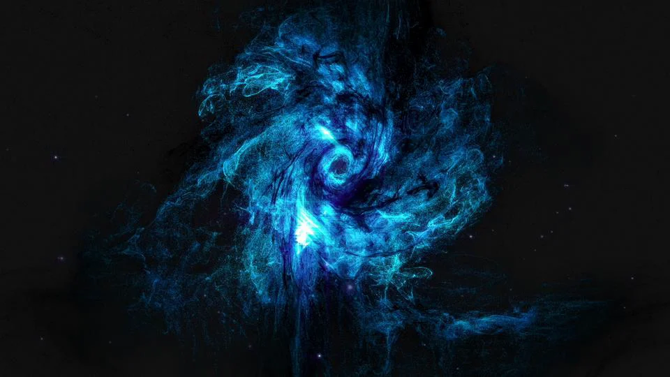
My new intro

Collapse
X
 
  • Time
  • Show
Clear All
new posts
  • #1
    Nothing.
    darkshark
    • Nov 2004
    • 4189

    My new intro

    Yep.

    My personal intro for my company. Made in 3ds max 2012 using Krakatoa, VRay, and AfterEffects CS5.
    Last edited by darkshark; 02-16-2012, 09:13 AM.
  • #2
    lol happy
    FFR Simfile Author
    hi19hi19
    • Oct 2005
    • 12283

    Re: My new intro

    Originally posted by darkshark
    splotchy patches in the blacks
    That really bothered me lol, looked like you wanted black smoke but against a slightly different shade black background it just looked weird.

    Explosion was sick, but the final font was a little hard to read, felt too "fuzzy"

    Might as well give constructive criticism because generally we all know what you make is going to be at least good, so why not shoot for amazing


    Comment

    • #3
      Nothing.
      darkshark
      • Nov 2004
      • 4189

      Re: My new intro

      Yeah now that you mention it the font is a bit small even at full screen. I'll go ahead and bump that up a few points. Yeah this splotchy crap is terrible, and youtube made it even worse. Going to have to end up putting a background plate in there.

      k fixed everything.

      My personal intro for my company. Made in 3ds max 2012 using Krakatoa, VRay, and AfterEffects CS5.
      Last edited by darkshark; 02-16-2012, 08:48 AM.

      Comment

      • #4
        lol happy
        FFR Simfile Author
        hi19hi19
        • Oct 2005
        • 12283

        Re: My new intro

        Yeah a lot better, font is more readable.

        Cool stuff 8)


        Comment

        • #5
          Digital Dancing!
          FFR Simfile Author
          FFR Music Producer
          rushyrulz
          • Feb 2006
          • 13109

          Re: My new intro

          sexy.


          Comment

          • #6
            🥓<strong><span style="col
            justin_ator
            • Mar 2007
            • 7688

            Re: My new intro

            Something about the transition from the . to the i really looks..weird? to me but I can't place what it is. It seems too sudden and blunt, I guess, like if you were making a short film and a person randomly appeared in your shot.

            Comment

            • #7
              soleil ardent
              FFR Simfile Author
              yo man im awesome
              • May 2007
              • 6578

              Re: My new intro

              Originally posted by justin_ator
              Something about the transition from the . to the i really looks..weird? to me but I can't place what it is. It seems too sudden and blunt, I guess, like if you were making a short film and a person randomly appeared in your shot.
              Yea, I'd say give it a half a second to a second more of looking at the "." of the i , with the bottom half coming in a at the same time as it is now. And possibly make the zoomout a bit slower

              Originally posted by choof
              you double dad loving dipshit
              Originally posted by t-rogdor
              dammit now i have to smoke a picture of choof out of a bong
              Originally posted by smartdude1212
              I can't be the only guy who has wondered what it'd be like to menstruate all over the shower.

              Comment

              • #8
                x'); DROP TABLE FFR;--
                Reincarnate
                • Nov 2010
                • 6332

                Re: My new intro

                Dude. Teach me.

                For the record, that is rather close to the sort of blue/black techy/space style I was trying to describe earlier.
                Last edited by Reincarnate; 02-16-2012, 05:10 PM.

                Comment

                • #9
                  🥓<strong><span style="col
                  justin_ator
                  • Mar 2007
                  • 7688

                  Re: My new intro

                  Originally posted by yo man im awesome
                  Yea, I'd say give it a half a second to a second more of looking at the "." of the i , with the bottom half coming in a at the same time as it is now. And possibly make the zoomout a bit slower
                  Kinda this. I don't really know if it's the fact that the section of the scene is too fast, or if it's just too abrupt in appearance.

                  I'm not saying it can't be an abrupt appearance, but it just seems like the way it is now it doesn't flow well like the rest of the clip. If there was like a flash of light and it was suddenly there, it might even make more sense. Iunno, my 2 cents.

                  Comment

                  • #10
                    Nothing.
                    darkshark
                    • Nov 2004
                    • 4189

                    Re: My new intro

                    Originally posted by Reincarnate
                    Dude. Teach me.

                    For the record, that is rather close to the sort of blue/black techy/space style I was trying to describe earlier.
                    Unless you're going to make a career out of it then honestly it's not even worth learning lol.

                    I'll play around with the timing at the end and see if I can get something that flows a little better.

                    Comment

                    • #11
                      x'); DROP TABLE FFR;--
                      Reincarnate
                      • Nov 2010
                      • 6332

                      Re: My new intro

                      Originally posted by darkshark
                      Unless you're going to make a career out of it then honestly it's not even worth learning lol.

                      I'll play around with the timing at the end and see if I can get something that flows a little better.
                      Not necessarily a career, but I'd like to be able to actually make cool shit for any games I design.

                      Comment

                      • #12
                        FFR Player
                        Emithith
                        • Sep 2008
                        • 1784

                        Re: My new intro

                        :\ the way the text just falls there doesn't seem so abstract like you had before, if it kinda just formed like steam or something like that, it would probably look better
                        /opinion
                        But really though, man that's awesome

                        Comment

                        • #13
                          Nothing.
                          darkshark
                          • Nov 2004
                          • 4189

                          Re: My new intro

                          I don't want to overdo it with crazy effects everywhere, there's got to be a calming point, and I want the focus to end on the name of the company, not the effects.

                          Uploading the extended ending version now.

                          **
                          This is &quot;v3&quot; by Shayne Webb on Vimeo, the home for high quality videos and the people who love them.
                          Last edited by darkshark; 02-17-2012, 07:02 AM.

                          Comment

                          • #14
                            Forum User
                            Spenner
                            • Nov 2006
                            • 2403

                            Re: My new intro

                            Very very narrow text, and I don't think it stands out as much as it should. IMO for your personal company I'd work out something that's as sleek, but bolder. Is the wordmark itself also the logo you'd be using?

                            My only nitpick though, the rest works fine

                            Comment

                            • #15
                              FFR Player
                              Emithith
                              • Sep 2008
                              • 1784

                              Re: My new intro

                              oh I guess my computer is to blame for false criticism this time, sorry ds, it works better if you can actually see the planet/sphere turn into the dot over the I, xD

                              Comment

                              Working...