

Re: FFR Shirt design submission thread.
the arrows need to be shifted more to the left so that it will be overall centered and not just the receptor arrow.
the font though lmao why would you have it be so big? the font is fine but having it just be a single line like in the rough i did would be preferred.
the arrows need to be shifted more to the left so that it will be overall centered and not just the receptor arrow.

the font though lmao why would you have it be so big? the font is fine but having it just be a single line like in the rough i did would be preferred.

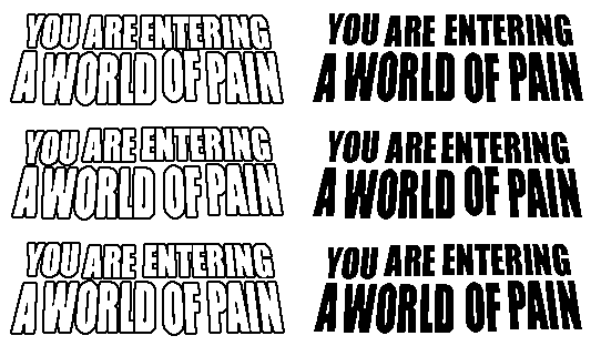



 - Tosh 2014







Comment