Favourite Fonts

Collapse
X
 
  • Time
  • Show
Clear All
new posts
  • Wayward Vagabond
    Confirmed Heartbreaker
    FFR Simfile Author
    • Jul 2012
    • 5866

    #16
    Re: Favourite Fonts

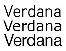
    fuck you verdana is amazing

    Comment

    • Spenner
      Forum User
      • Nov 2006
      • 2403

      #17
      Re: Favourite Fonts


      Which one is the real verdana? but srsly which looks best?

      Comment

      • Wayward Vagabond
        Confirmed Heartbreaker
        FFR Simfile Author
        • Jul 2012
        • 5866

        #18
        Re: Favourite Fonts

        the second one is the most appealing to me. the third one is too rounded and the first one has weird arches and feels too tall.

        Comment

        • Sweet Angel
          \(o.o)/ ~(e.e)~
          • Apr 2012
          • 620

          #19
          Re: Favourite Fonts

          Originally posted by Spenner
          Blegh, I think they're awful

          I feel like they're something I'd only use once ever, to suit a certain style for a header of a magazine ad or something like that. Bisque and Serpentine are the only ones I'm fond of from there. I'm pretty picky though.
          Yeah I guess you're right, but I still really like them xD Especially evolution, just something about really round letters I like. A few others I enjoy

          Annnd
          Century Gothic I suppose

          8th Official - Top 209th Official - Top 16


          Comment

          • Spenner
            Forum User
            • Nov 2006
            • 2403

            #20
            Re: Favourite Fonts

            Originally posted by Wayward Vagabond
            the second one is the most appealing to me. the third one is too rounded and the first one has weird arches and feels too tall.
            Shit taste you're supposed to favour Aaux pro hehehe. If nothing else I prolly just love how smooth the edges are no matter what with Aaux.

            Those top 4 are pretty cool Sweet Angel, the handwritten one isn't overdone or comic sans-like.

            Comment

            • DragonIIDX
              Not dragon, but dinosaur
              • Aug 2008
              • 916

              #21
              Re: Favourite Fonts


              Originally posted by clasko1000
              banned for having an affair with peach
              Originally posted by dAnceguy117
              d-guy and d-guy skype pals 10/15/13
              Simfiles Updated 11/30/13

              Comment

              • Spenner
                Forum User
                • Nov 2006
                • 2403

                #22
                Re: Favourite Fonts

                Few fancier ones I like:


                <- not with the word Lobster, but with certain things it looks nice.

                Comment

                • Gundam-Dude
                  `~`
                  FFR Simfile Author
                  • Oct 2005
                  • 7327

                  #23
                  Re: Favourite Fonts

                  Originally posted by Spenner
                  I really love that Geogrotesque one Gundam Dude; I must say though, I REALLY dislike some of the fonts like Franklin Gothic, Eurostile, Trade Gothic, and especially Verdana.
                  Geogrotesque was a funky typeface for me at first but it started to grow on me the more I used it—I first discovered it when I was out interning at Robert Kennedy Publishing and I had to make various rectangular web rotators.

                  Franklin Gothic in particular is one of my typography prof's personal favourites which also grew on me when I had to use the typeface for one of my final semester campaigns. Pretty much to better resonate with the campaign's theme, we were stuck with grotesque typefaces that weren't Helvetica and Franklin Gothic was one of the final choices—I had a thorough discussion with my prof over the typeface choice since it didn't exactly click with me initially, lol.

                  Eurostile is just a personal favourite of mine if I ever need a squarish typeface that isn't too condensed like Geogrotesque, and has varying weights. Trade Gothic is an odd typeface in itself since it's hard to classify strictly under grotesque due to the humanist-like features from being hand-altered—it sits right between the border of both classifications, which is a nice alternative if I ever need a typeface that has both classes' qualities or if I'm just being an undecisive motherfucker that can't pick between the two, lmao.

                  Verdana isn't one of my absolute favourites, but it's a decent typeface to recommend people, who don't have any fonts that aren't pre-installed into their machines, that need some other sans-serif that isn't Arial or Calibri.

                  Originally posted by Spenner
                  I'm happy to see no Bleeding Cowboys so far @__@
                  word up brotha
                  Last edited by Gundam-Dude; 05-8-2013, 12:25 PM.


                  (Download My Magnum Opus, Solo Kpop Pack!)

                  My Simfiles (4key & 6key)

                  Comment

                  • Coolboyrulez0
                    VICES
                    FFR Simfile Author
                    FFR Music Producer
                    • Aug 2006
                    • 10042

                    #24
                    Re: Favourite Fonts

                    for manga work I do its mainly:
                    Anime Ace / 2.0
                    Wild Words
                    Another
                    CC Comiccrazy
                    Evil Genius

                    and few certain more -- I also try to have a fitting "comic" font for characters that are bubbly, mean etc. it's all gotta fit.
                    Last edited by Coolboyrulez0; 05-8-2013, 12:38 PM.
                    https://soundcloud.com/cbrbreakcore
                    https://cbrrecords.bandcamp.com/

                    Comment

                    • rushyrulz
                      Digital Dancing!
                      FFR Simfile Author
                      FFR Music Producer
                      • Feb 2006
                      • 12985

                      #25
                      Re: Favourite Fonts

                      Edwardian Script ITC
                      Last edited by rushyrulz; 05-8-2013, 12:40 PM.


                      Comment

                      • DossarLX ODI
                        Batch Manager
                        Game Manager
                        FFR Simfile Author
                        • Mar 2008
                        • 15004

                        #26
                        Re: Favourite Fonts

                        I tend to be more simplistic so I like fonts such as Helvetica.
                        Originally posted by hi19hi19
                        oh boy, it's STIFF, I'll stretch before I sit down at the computer so not I'm not as STIFF next time I step a file

                        Comment

                        • Spenner
                          Forum User
                          • Nov 2006
                          • 2403

                          #27
                          Re: Favourite Fonts

                          I think I'm falling in love with that geogrotesque, time to get the whole font family of it I'd even consider paying for that if it weren't $300 for the whole set lol. Kind of ridiculous some of the prices on fonts. I guess if you need proper licensing for a big project it's all good but still, not practical for personal use *~*

                          It's a funny thing with some fonts... I don't mind using just plain ol' ariel at all if I need something with regular weight. I tend to lead towards Aaux cuz of how strong it is in all weights; from black to thin I dig every one. Condensed fonts are a bit trickier, I like heroic condensed:


                          Sometimes I use the condensed helvetica, its not bad at all. Or Interstate.

                          I think a lot of helvetica's popularity is based on the fact that there's so many fukken variants of it, can easily adhere it to whatever you're working on. I prefer to say I'm not using it though it's so plain. And I hate the tails on the a's. If I had to choose it's biggest flaw it'd be that ugly ass tail.

                          What the fuk is this goofball talking about in this quote??? Subjectivity but hell, it stands out like a broken limb.

                          Last edited by Spenner; 05-8-2013, 02:59 PM.

                          Comment

                          • Gundam-Dude
                            `~`
                            FFR Simfile Author
                            • Oct 2005
                            • 7327

                            #28
                            Re: Favourite Fonts

                            I'd use Univers over Helvetica anyday, hell any other grotesque class. It's such a fucking boring typeface, even Comic Sans is much more interesting than it ever will be—there I fucking said it. A few of my other typography profs' favourite quotes were:

                            "You could put Helvetica Bold in 72pt on a white canvas and it'll look nice and BORING."

                            "If you want to fail my class, use Helvetica."
                            "You're not allowed to use Helvetica in my class."
                            etc.

                            I'm guilty of using Helvetica in 80% of my projects in my first year and if I could go back in the past and smack myself, I absolutely would.

                            Also yeah, I'm not fond of the Helvetica's lowercase a tail either RIP


                            (Download My Magnum Opus, Solo Kpop Pack!)

                            My Simfiles (4key & 6key)

                            Comment

                            Working...