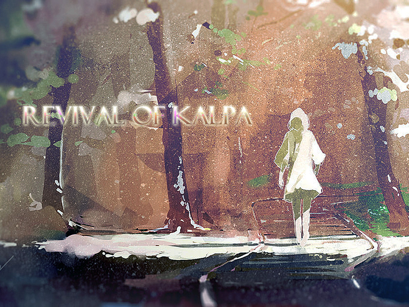
Just a quick tip I picked up from my mom of all people, since I've noticed this a lot. When it comes to the positioning of the text, try to keep the center of it either near or below the vertical center of the image so the text doesn't feel randomly placed, or as my mom put it 'loose'.
I always argue that dead center is boring, dull, and uninteresting. Offsetting to a side is more visually pleasing as it's natural for text and body copy to be left/right aligned rather than centered. And I guess if you're incredibly OCD and take into consideration layout guides such as the golden ratio, nothing is ever dead center as the sweet spot is always offset to a side.
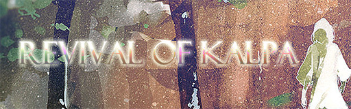
Although, in the case with headline type like in Stepmania banners, dead center is a little more acceptable due to the space constraints, so it's not a big deal—with backgrounds though, it's more jarring considering the amount of space you have to work with.
idk just my opinion as a designer, but it really doesn't matter in the end when this is for STEPMANIA
[9:12:30 PM] Nick Weiss(IcyWorld): ok just played send my love to mars with the anime graphics, i think i like them that way
[9:12:45 PM] Nick Weiss(IcyWorld): way more fitting now that i see it togeter xD


Comment