I looked at it for a good whole minute or so trying to figure out what it said. Then I read your post and realized I still got it wrong.
This is why I don't like graffiti.
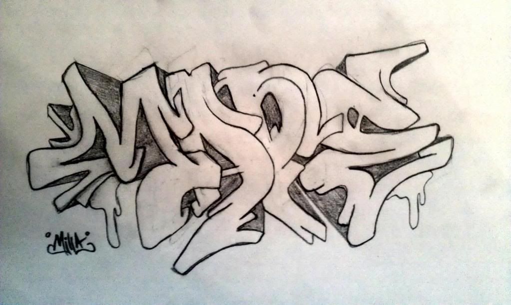
Really? What did you think it said? I try and make my graffiti more on the legible side, because I don't like graffiti that's impossible to read either.
It didn't help that the "D" has a lower extension that makes it look like "P", and then the "E" is drawn at a lower level than the rest of the letters. It's easier if the words were aligned straight. I mean, they can still look "squished" and whatnot, but you typically read from left to right, not left to right and up and down.
It's hard to figure out which part of the letters are the important ones I need to discern the word properly. Recognizing the "D" only requires me to look at the top half of the letter, as that downward extension is distracting. Recognizing the "E" however requires me to look at the whole letter, and thus appears twice as large as the "D".
I guess to summarize, there are elements in that graffiti that are distracting me from recognizing the word. The only letter I recognized right away was the "M".


Comment