commentary of my GIMP signature.

Collapse
X
 
  • Time
  • Show
Clear All
new posts
  • DJ moe_bass
    FFR Player
    • Jun 2009
    • 62

    #1

    commentary of my GIMP signature.

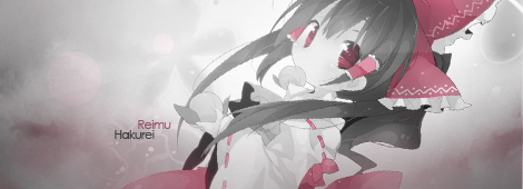
    Please say something about my signature, I just want some advice on improving in my graphic design skillz. The critique you put in this thread will effect how the finished (if not) siggy will appear. thx

    EDIT: Image components: 3 main layers; gradient,brushes,and original image. the gradient goes white to black from top to bottom. the brushes are on the upper right and left corner and another lightly printed one in the middle (the stars). the original image is this:
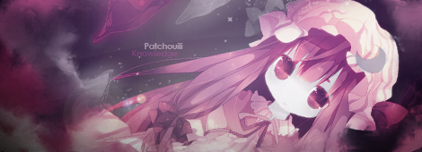
    The texts font in the middle is TrajanusBricksXtra, you can get it from this site http://www.dafont.com/. I merged the layers then copied it to merge it again so the colors would be more defined.
    ps: I also have photoshop as well but I dont use it, this is because I'm use to GIMP.
    Last edited by DJ moe_bass; 08-5-2009, 02:40 PM.
    Originally posted by OneHandNow
    mio is obviously googleplex/10

  • Mollocephalus
    Custom User Title
    • Jul 2009
    • 2608

    #2
    Re: commentary of my GIMP signature.

    first of all, what did you actually do yourself out of the whole image and its components? nothing significant can be said without such information.

    Comment

    • Nightfirecat
      ...back from the dead.
      • Nov 2006
      • 3213

      #3
      Re: commentary of my GIMP signature.

      Pretty decent, but not much blending or anything.

      P.S. That text is REALLY F*CKING HARD TO READ.


      [My Profile] | [My Music] | [Play FFR] | [My Photobucket] | [My DeviantArt]

      AAAs: 210 (186+7+17)
      Best AAAs: Vertex BETA, Fighting for Control, Nova Pulser
      Recent AAAs: {Firestorm}, Dazzling Destiny, Hellbeat v2p

      2nd place in 3rd Official Tournament
      1st place in Jugglin/Jteh's 1st Tournament

      Comment

      • DJ moe_bass
        FFR Player
        • Jun 2009
        • 62

        #4
        Re: commentary of my GIMP signature.

        Originally posted by Nightfirecat
        P.S. That text is REALLY F*CKING HARD TO READ.
        ok, I will change that but I was aiming for something fancy thats somewhat hard to read. lol I think i made a bad choice.
        Originally posted by OneHandNow
        mio is obviously googleplex/10

        Comment

        • chidori!
          FFR Player
          • Jun 2007
          • 1603

          #5
          Re: commentary of my GIMP signature.

          the text is easy to read for me
          also for one thing you stretched the silhouette image too much
          also if you have photoshop cs2+ i can show you how to use it, you won't go back once you can use it

          Comment

          • darkshark
            Nothing.
            • Nov 2004
            • 4189

            #6
            Re: commentary of my GIMP signature.

            Don't quit your day job.

            It's pretty bland.

            Comment

            • Mollocephalus
              Custom User Title
              • Jul 2009
              • 2608

              #7
              Re: commentary of my GIMP signature.

              1. text is not centered

              2. what chidori said

              3. the square effect is kinda cool but it's not immediately readable

              4. the text covers part of the silhouette which is bad. move it up.

              5. enhance the black/white effect to gain more contrast maybe?

              6. text could use some more variation in positioning. i'm pretty sure that is a single paragraph and the interline space was automatically set.

              7. add a vignette effect to place the attention towards the center? make the brush in the two upper corners bigger?

              8. the font itself is really bland and does not communicate action, energy, like the rest of the image does.

              Comment

              • Garquillex
                FFR Veteran
                • Oct 2005
                • 965

                #8
                Re: commentary of my GIMP signature.

                I used gimp for years. Then I got photoshop. Now I realize how much better it is than gimp. Use it.

                Comment

                • DJ moe_bass
                  FFR Player
                  • Jun 2009
                  • 62

                  #9
                  Re: commentary of my GIMP signature.

                  i might use photoshop now since it may be better and I will try not to stretch out images that far. The blandness I couldnt help since im a noob. :P
                  Originally posted by OneHandNow
                  mio is obviously googleplex/10

                  Comment

                  • Nightfirecat
                    ...back from the dead.
                    • Nov 2006
                    • 3213

                    #10
                    Re: commentary of my GIMP signature.

                    The font choice isn't bad, just kinda hard to read.

                    Maybe add some effects to it to fix that?


                    [My Profile] | [My Music] | [Play FFR] | [My Photobucket] | [My DeviantArt]

                    AAAs: 210 (186+7+17)
                    Best AAAs: Vertex BETA, Fighting for Control, Nova Pulser
                    Recent AAAs: {Firestorm}, Dazzling Destiny, Hellbeat v2p

                    2nd place in 3rd Official Tournament
                    1st place in Jugglin/Jteh's 1st Tournament

                    Comment

                    • albaneenesk8r
                      I Fap For Justice
                      • Jul 2006
                      • 1420

                      #11
                      Re: commentary of my GIMP signature.

                      its still sexy. silhouette rave ftw
                      Originally posted by Plan_Bsk81127
                      FFR retards at their finest. gg
                      My hero
                      Originally posted by 04im
                      u so heavy even aphro cant carry ur ass

                      Comment

                      Working...