-
Re: [Zaggy] Credits or CASH for Artwork!
Ok, Silvuh.

1. Make the text stand out more.
2. The look is perfect.
As for the font type, neither of us has any particular taste. Except that the font doesn't look right in your banner. I can only suggest going with your personal preference, and taking the text from http://www.passionro.com into consideration.
Thanks. :]Comment
-
Re: [Zaggy] Credits or CASH for Artwork!
Aww.. mine is taking way longer than expected. If you need a top banner for your site, I can probably show you a sample in a day or two.Comment
-
Re: [Zaggy] Credits or CASH for Artwork!
Sooorrry for the wait, Zag! Here're these now!


Comment
-
Re: [Zaggy] Credits or CASH for Artwork!
Excellent.
Both myself and Haku feel that there is something missing. We haven't the slightest idea what. It's annoying.
 I really like what you've done.
1. Create 2 darker font variations (Make PassionRO darker/more defined)
2. Modify the Passion is what we are all about. (Smaller righthand lower corner, and transparent)
Thanks.
Also perhaps edit the small ffffttftff in the right hand corner. not sure what it is but its a little pixilated.
Haku agrees,
"and the background, hmm, has to be bolder and less fuzzy""
^^;
P.S. We feel bad asking for changes, but it needs to be changed.
Check this out, again, for ideas.
Edit:
I believe Haku and I have come to a consensus on what was making us iffy about it! The Headphone girl is too transparent. Please, as well as the currently requests variations, please create one with a fully visible girl.
Sorry once again. ^^;Last edited by Zageron; 07-3-2009, 11:19 PM.Comment
-
Re: [Zaggy] Credits or CASH for Artwork!
Transparent text? Or did you mean semi-transparent? I made it transparent, but, well, because of course you can't see that, I made the glow around it more obvious... It doesn't really look that good, but I'm not exactly sure what you're looking for.
And I have no idea what you're talking about with the "fffftftff".
I took the clouds out of the background so maybe that's less fuzzy.. and I removed the wet brush dabs that added to the transition because apparnetly you wanted it all bolder or something? Sorry, uhm.. well this is what it looks like now.
If more things need to be changed, that's fine. Don't want you left with something you're not content with.


Aaand here it is without the grainy texture.


Aaand sorry for not reading everything you said on MSN, hahahaa. Whoops! I'm just talking with like, seven people, so yeah. Heeere it is with the houses blurred just a tad, and the texture is back.


Aaand here she is again above the texture and then the same but with the text lighter like before.
And now between those two is one where the text is just a shade darker.


 Last edited by Silvuh; 07-4-2009, 12:26 AM.
Comment
-
Re: [Zaggy] Credits or CASH for Artwork!
i liek the 2nd one :3Comment
-
Re: [Zaggy] Credits or CASH for Artwork!
So basically it must include anime characters.
Yeah I'm out. Good luck Zag.Comment
-
Comment
-
Re: [Zaggy] Credits or CASH for Artwork!
maybe use characters from ragnarokonline
Comment
-
Comment
-
Re: [Zaggy] Credits or CASH for Artwork!

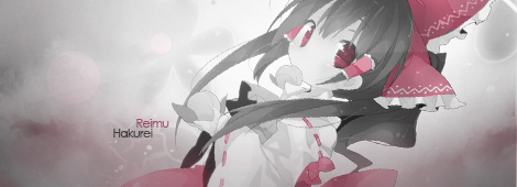
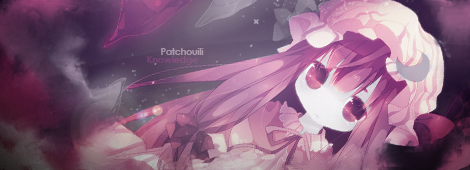
well, heres mine,
i tried

I'D LIKE SUM PANCAKE!Comment
-
Re: [Zaggy] Credits or CASH for Artwork!
incase u dont like the font, (maybe its too girly? :P) id like to know which font is used for the Passion RO homepage
(that is, if u like the design lol)
I'D LIKE SUM PANCAKE!Comment
-
Re: [Zaggy] Credits or CASH for Artwork!
so i can use a different anime girlOriginally posted by ~jroddOriginally posted by ~Tao of DossarComment
-
Re: [Zaggy] Credits or CASH for Artwork!
It's very good Blu3Blur but I think we've already decided on one. I will keep it Bookmarked and we will discuss banners further.
Anyone is still free to make banners, they may be used in the future with your permission. (I may even pay you if I like it enough. ;])
You can do whatever you want. <3Comment



 ?
?








Comment