I=<3 text effects.
-

-
Uglay.
Signature subject to change.
THE ZERRRRRG. -
smfreak900: Uglay?
QreepyBORIS: yeah
smfreak900: it purdy
QreepyBORIS: nah
QreepyBORIS: pixelay
smfreak900: its jpeg
smfreak900: whaddya expect
QreepyBORIS: but like
QreepyBORIS: THAT pixelay?
smfreak900: i dunno
smfreak900: it was
smfreak900: just like that
smfreak900: i dunno lol
QreepyBORIS:
smfreak900: the shadow is supposed to be like that, btw
smfreak900: but notin else
QreepyBORIS: yeah
smfreak900: oh wellComment
-
It's jpeg? It's jpeg?
Worst excuse ever. It's because you don't know what antialiasing is.

Comment
-
If it were originally bmp, then it would be like, a DEEEEEEEEEECCCCCCCEEEEEEEEEEENNNNNTTTTTTT excuse.
But the point was yeah, he didnt anti alias. Like, at ALL.
Signature subject to change.
THE ZERRRRRG.Comment
-
-
It look's like piss is oozing around the letters randomly.
Comment
-
Oh yeah...
I just noticed...
The pic's name is hello.jpg. LMAOComment
-
Why are there random multi color lines iin it?Comment
-
Because it LOOKS NEAT. That was the whole point of this thread.Comment
-
Actually it doesn't look neat. It looks completely shitty.
Comment
-
Not as shitty as this, lol.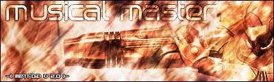
Comment
-
Laugh.Comment
-
i like that font. where did u get it since im lacking fonts..
but what you did to it blows meat. lol
Comment
-
I like my font to Reach, lol.Comment
Comment