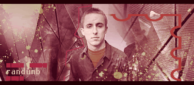
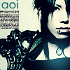
Image plus an overlay of trees and some hueing layers... Okay. Pretty, but just an exercise in blending layers.
This is really good but is absolutely ruined by the typography. Good use of direction and motion in this one. The dashed lines to the right are also too contrary to the motion of the piece and should be redone or removed. I'd also recommend lowering the placement of 'exhilarate' to be flush with where the lower white chunk on the background image occurs... This creates a better unity between the image and the foreground.
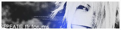
Blending layers, contrast, and what looks like apophosis overlays... Falls into the same category as piece #1... It doesn't really convey anything and is purposeless, but is somewhat nice to look at.
Another good piece with horrible typography. The red line is also a leading line to the right, I'd recommend just removing the text altogether so that the red line has control of the focus and can lead into the darkness of the right side. The image would appear much more powerful that way
Ditherboxing. lol. This image is boring and doesn't really have any focus to it. Typography is weak once again.
Nice vector work but the gold hoops appear way too thick, especially the one on the front of the left hand (referenced from viewing the image). The seasons text should be very slightly less tilted to maintain proper perspective.
All in all, not bad. Work on your typography a bit.
If I remember correctly, I never overlayed trees in the first one.
I like high contrast because it makes my eyes feel good.
I know, I'm really bad at adding text and stuff. xD
By the way, what is ditherboxing and apophysis?
How in the hell do you do those brush compilations? I cannot figure it out.
Oh edit for new work. I used a tut and followed it for this one. I had to make my own planet because the brush set he linked to was for an earlier photoshop version =//
Comment