Here is a panoramic picture i put together and modified a little bit in my computer class. Please take note that i didnt take the pictures and i used the top 3 to make the bottom one.
(It may sound silly, but I'm scared to post on these forums, I feel like I'll get eaten alive, or banned, as I've seen quite a bit of already.)
Anyway, you guys are really good at Photoshopping and such. I don't really know a lot though, even though I've has PS7 for a few years. My level is quite limited, unfortunately.
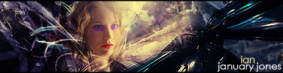
Just made this a few minutes ago, I haven't used PS in a few months I suppose. Rather clich�, sorry:
Although, I pretty much never can get .gif images to look right, or decent, unless I'm working with animated stuff. It's kinda hard for me to get text to look decent as well, on anything.
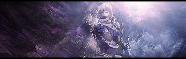
And I was working with some other stuff a few months ago (With help from tutorials), and I got several weird-looking pictures out of it:
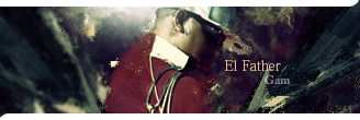
I usually work with banners/avatars....and I was leaning towards more animated stuff. Last was animated banners, but yeah...
You guys are good. I'll probably go look at some suggested links sometime and see what else of a different genre I can conjure up.
Originally posted by Raveren
Let's put this in another context.
"Hey, do you remember the name of that group that hit those skyscrapers in America with their own planes? It was 'Al' something...if anyone here can tell me where they are going to meet next, that'd be great."
(It may sound silly, but I'm scared to post on these forums, I feel like I'll get eaten alive, or banned, as I've seen quite a bit of already.)
Anyway, you guys are really good at Photoshopping and such. I don't really know a lot though, even though I've has PS7 for a few years. My level is quite limited, unfortunately.
Just made this a few minutes ago, I haven't used PS in a few months I suppose. Rather clich�, sorry:
Although, I pretty much never can get .gif images to look right, or decent, unless I'm working with animated stuff. It's kinda hard for me to get text to look decent as well, on anything.
And I was working with some other stuff a few months ago (With help from tutorials), and I got several weird-looking pictures out of it:
Oh, I have C2. (LOL, Limewire.) I couldn't get very comfortable with it. PS7 suits all my needs fine, so it's better to keep that than to overdo it.
Originally posted by Raveren
Let's put this in another context.
"Hey, do you remember the name of that group that hit those skyscrapers in America with their own planes? It was 'Al' something...if anyone here can tell me where they are going to meet next, that'd be great."
Here's why people should stop making signatures all day:
When you work with really cropped down spaces it becomes really easy to hide all the faults and errors. You can chop images down to 25% size and hide all your cropping errors, all your bad blurring, all the harsh levels from blending modes, and so on. Also, when you work with a size that small there's no time to actually have to weave much higher level structure to the piece. You can just work with a few basic color gradations and use something as simple as a rule of thirds mindset to completely control whatever fleeting macrostructure there is in the image.
When you work with larger resolutions you have so much space that you actually have to have a scheme, an idea, and a cohesive notion of space to order all of the gestalts of the image. You learn how to actually structure pieces rather than take a background and throw on a few blurs until it looks pretty, because now you are no longer concerned with just micro features, but also macro structures which dictate much of the flow and aesthetics of an image that is completely nonexistant at small resolutions.
SM backgrounds are kind of like the half-way point between these two. They're glorified sigs at a somewhat larger resolution. They still fall back onto the idea of making text the centerpoint of a piece (and this isn't the case in most images, unless it's a typographical piece or some kind of title/logo design), and they still fall back on using many of the empty conventions of sig-making. The focus is still empty abstract appeal by blending modes and overlaying random images.
I don't care if you all don't like darkshark and want to bitch at her for not having 'credentials', but she makes a point that you all will not develop much as artists when you can hide all of your mistakes and ignore all of the macro structures by peering into a tiny 400x100 window instead of dealing with the whole space the medium is offering you. I pissed away the first two years in photoshop never making anything larger than a large signature. It wasn't until I got 3d studio max and actually stepped outside of my comfort zone that I actually started getting somewhere as an artist. When you stay inside of your comfort zone you learn to stagnate into functional fixedness instead of learn the full array of tools your programs have to offer to you. Seriously, don't let that happen to you.
Edit: To slipstrike
When stitching panoramic landscapes, I've found its best to work on the ground and sky as two separate elements. Quickmask the two apart into separate layers and then work on lining each one up. It makes you have to focus on aligning much less at a time because you can break it down into half-size chunks instead of trying to tackle alignment all the way at once. It's easy to hide because most skies have gradual gradients as you go horizontally across the images, so even if your sky isn't exactly aligned as it was before the panorama, the blend back into the foreground should still appear to look completely natural.
But if you do this, make sure to write down all the free transforms you do on each of the parts so you can reapply them to the other layer without skewing things out of perspective.
I've been experimenting with large resolutions such as 2000X2000. That one lines picture, the purple one, is actually in 1600X1200 but photobucket sized it down.
Here's why people should stop making signatures all day:
When you work with really cropped down spaces it becomes really easy to hide all the faults and errors. You can chop images down to 25% size and hide all your cropping errors, all your bad blurring, all the harsh levels from blending modes, and so on. Also, when you work with a size that small there's no time to actually have to weave much higher level structure to the piece. You can just work with a few basic color gradations and use something as simple as a rule of thirds mindset to completely control whatever fleeting macrostructure there is in the image.
When you work with larger resolutions you have so much space that you actually have to have a scheme, an idea, and a cohesive notion of space to order all of the gestalts of the image. You learn how to actually structure pieces rather than take a background and throw on a few blurs until it looks pretty, because now you are no longer concerned with just micro features, but also macro structures which dictate much of the flow and aesthetics of an image that is completely nonexistant at small resolutions.
SM backgrounds are kind of like the half-way point between these two. They're glorified sigs at a somewhat larger resolution. They still fall back onto the idea of making text the centerpoint of a piece (and this isn't the case in most images, unless it's a typographical piece or some kind of title/logo design), and they still fall back on using many of the empty conventions of sig-making. The focus is still empty abstract appeal by blending modes and overlaying random images.
I don't care if you all don't like darkshark and want to bitch at her for not having 'credentials', but she makes a point that you all will not develop much as artists when you can hide all of your mistakes and ignore all of the macro structures by peering into a tiny 400x100 window instead of dealing with the whole space the medium is offering you. I pissed away the first two years in photoshop never making anything larger than a large signature. It wasn't until I got 3d studio max and actually stepped outside of my comfort zone that I actually started getting somewhere as an artist. When you stay inside of your comfort zone you learn to stagnate into functional fixedness instead of learn the full array of tools your programs have to offer to you. Seriously, don't let that happen to you.
Edit: To slipstrike
When stitching panoramic landscapes, I've found its best to work on the ground and sky as two separate elements. Quickmask the two apart into separate layers and then work on lining each one up. It makes you have to focus on aligning much less at a time because you can break it down into half-size chunks instead of trying to tackle alignment all the way at once. It's easy to hide because most skies have gradual gradients as you go horizontally across the images, so even if your sky isn't exactly aligned as it was before the panorama, the blend back into the foreground should still appear to look completely natural.
But if you do this, make sure to write down all the free transforms you do on each of the parts so you can reapply them to the other layer without skewing things out of perspective.
Well of course i know more shortcuts and easier ways to effectively combine the panoramic pictures. Keep in mind that it was my first panoramic picture and the only reason i put it in was cause it was the only one i had saved and i really dont care to go in and do it again to make the sky look better.
Also, it really is true that the smaller a pic is the more you can get away with. If anything it promotes laziness. Its not necessarily that they are bad artists, its more that they have learned to be lazy with their pieces.
Anyway, how did you get out of your comfort zone cause of 3D max studio? Granted it is way fun to fool around and it helps you keep the whole picture in mind while you are working, but i just dont see how it helped you get out of the habit of hiding things cause you can do it just as easily in 3D max.
If i can i will try to put my first attempt at 3D max on later, it is supposedly a journey from earth to mars and back.
Hmm... im really dissapointed with how much traffic this part of the forums gets...
Short animation I threw together, just to show reflective properties on different surfaces.
I plan on making a short movie using this as the main character.
The quality that youtube made it is horrible though.
LOL, this is probably the most pretentious and ****ty GFX community I have ever been a part of... its sad and disgusting to tell the truth. We're not here to satisfy you "real" artists and I'm not here to hate anyone either. But if you're going to post something about Photoshop and art in general, AT LEAST have the courtesy not to come off as a pretentious asshole while doing it, because no one form of art is greater than any other form of art, its the people that THINK that there are superior art forms are the ones that make GFXing a very hostile environment, especially when there comes a person that can actually defend themselves. So think on this, leave the GFXers to their respective art because no one is criticizing the way YOU do things because we are better than that and also we dont really have time to bring anyone down. Honestly, get a clue.
Last edited by YoUgOtBeAtByAgUrL; 06-2-2007, 12:04 AM.
Reason: You know you're pretentious when, you link someone to a Wikipedia article during your post.


Comment