Okay... They just seem really rough. A big tip is to make your text stand out more. (with things like the last two)
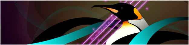
The second thing is low quality but whatever. I pretty much only like the third one and the sixth one. The seventh one is alright. I'd say try some borders on them, mainly the last one, and make text blend less. Really general because this isn't much to look at.
Originally posted by ~jrodd
keep ur head up or down whatevers most comfortable idk but ya i repsect u cuz u respect others and we all have opinions to share, so respect one another and keep being urself or someone else watever
Originally posted by ~Tao of Dossar
I never self-reflect, and therefore, I have no negative thoughts about myself. However I am also aware about my successes.
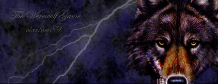
They're okay; your sig is the best one up there. Just keep practicing what looks good/what doesn't and experiment with different styles. I see that you're not completely relying on brushes for the most part, which is a good start, so keep it up.
AAAs: 210 (186+7+17)
Best AAAs: Vertex BETA, Fighting for Control, Nova Pulser
Recent AAAs: {Firestorm}, Dazzling Destiny, Hellbeat v2p 2nd place in 3rd Official Tournament
1st place in Jugglin/Jteh's 1st Tournament


Comment