-Ultimatum's PS Art-

Collapse
X
 
  • Time
  • Show
Clear All
new posts
  • Ultimatum
    FFR Player
    • Oct 2007
    • 158

    #1

    -Ultimatum's PS Art-

    I've decided to just make my own thread showing mostly my sigs and what-not...

    It's easier than posting in the "Post Your Photoshop work" thread.

    Here's a few things I've made. (constructive criticism is acceptable )


    Last edited by Ultimatum; 01-12-2008, 07:49 PM.

    Join at own risk lol.
  • Nightfirecat
    ...back from the dead.
    • Nov 2006
    • 3213

    #2
    Re: -Ultimatum's PS Art-

    Originally posted by Ultimatum
    That one is 1337. Aweesome.

    Originally posted by Ultimatum
    That one doesn't really emphasize tiger woods... Not a bad thing, just doesn't seem to fit the theme.

    Originally posted by Ultimatum
    Also pretty awesome... Again-- more light on the character in the picture might help... A few darker parts that look a bit shattered because of filters, but great background.

    Originally posted by Ultimatum
    Again-- few dark areas that look fractured/shattered because of over-filtering. Rest of it is great.

    Originally posted by Ultimatum
    This is probably the one I liked the least, because of the bad quality on the mannings picture... Blurred, bad contrast, a bit of the above color-shattering as in mj and ratchet... But the background is again--wonderful. I can't compare to you in that way.

    I'd work on getting more of a feel for the character/sports renders that go into your pictures... Try for a fading to black/dark matter on one side effect... I think you'd do very well... Kind of like the way you did with the LeBron pic. That one did great.

    Not much else to say. I'm not great at ps, but I can judge well. If I were to give you a rating, 8.75/10. The abstract backgrounds are to die for.

    Anyway, [/long post]


    [My Profile] | [My Music] | [Play FFR] | [My Photobucket] | [My DeviantArt]

    AAAs: 210 (186+7+17)
    Best AAAs: Vertex BETA, Fighting for Control, Nova Pulser
    Recent AAAs: {Firestorm}, Dazzling Destiny, Hellbeat v2p

    2nd place in 3rd Official Tournament
    1st place in Jugglin/Jteh's 1st Tournament

    Comment

    • arrekusuof93
      FFR Player
      • Feb 2007
      • 1163

      #3
      Re: -Ultimatum's PS Art-


      Nice colors, but the composition could use work. This is mostly aimed at your focal point. There's no specific focus on this signature, this is to say that your blending is good, but overdone. You should try to bring out the focus on Master Chief by placing him more in the center, and blurring slightly places in the background away from him. Text could use work. It doesn't particularly adapt to this signature.


      After an inspection of this one, I'd say it's better than the last. The colors, once again, are great. However, it seems really messy. It's almost as if you tried to get a shattered glass effect in the background. If that's so, then you should try to enhance it, and filter out some of that red and blue craziness you have clipped on there. Although I've just pointed out that it's messy, the focal point is still more defined than the last signature.


      This one is very nice. I think if you hadn't let Tiger seem so transparent, it would be much improved. Also, the text saying "Tiger" could just be removed... as I think the symbol you have on the right fits perfectly.


      Nice effects on the right side of this one. It seems as though it gets really dull on the left, however. Border needs to cover the very outside for it to be a border. The stylistic inline border is nice, however. 
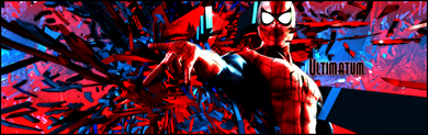
My best advice for this one is don't make the brushing fade into the background without purpose. Brushes should at least try to add to the flow/depth/another quality of this sig.


      For the border, refer to the same comment on the previous sig. I think placing the basketball player in front of those horizontal lines would add to the signature's depth. Some color variation would help as well.


      Needs a proper border, and it needs to be a bit smaller. It looks like you have the right idea as for depth, but didn't quite accomplish it. Text isn't all that bad, either.


      Not really sure what to say about this one. This one seems a tiny bit messy, as well. I think perhaps if you increased the width, and took another approach to the text that this signature would improve.


      Needs a proper border. You should try varying the blurriness/sharpness between the brushing in the background to increase depth. Also try overlapping a small amount of the brushes over Manning.

      Wow that was a long post....

      Comment

      • customstuff
        ♥C.S. + A.M.♥
        • Nov 2006
        • 4892

        #4
        Re: -Ultimatum's PS Art-

        That spiderman one is insane! Good work!

        Originally posted by MrMagic5239
        Placements are final, custom will not be moved to D6, just because he is good at jacks, and mediocre at just about every other FMO in the game.
        Originally posted by customstuff
        Originally posted by MrMagic5239
        welcome to D6

        start playing

        Comment

        • danny53x
          AKA Yotipo
          • Jan 2007
          • 1008

          #5
          Re: -Ultimatum's PS Art-

          Personally, I just think you need more emphasis on the characters them self. The designs and poses are great (except for Tiger), but on a few, the burned borders really don't fit. I've never taken any classes, and I don't have but about a year of experience in PS, but I don't encourage burning the border so the brightness shines on the center. Rather, try to keep the whole design full and balanced. Of course there are ways to create balance with the character on one side or the other, however symmetry can be helpful at times.

          Keep with making them, I approve :]
          Last edited by danny53x; 01-6-2008, 06:26 PM. Reason: Typo: "but I don't encouraging burning"

          Comment

          • Nightfirecat
            ...back from the dead.
            • Nov 2006
            • 3213

            #6
            Re: -Ultimatum's PS Art-

            Originally posted by arrekusuof93
            Wow that was a long post....
            Yeah... So was mine.

            Long post wars lawl.


            [My Profile] | [My Music] | [Play FFR] | [My Photobucket] | [My DeviantArt]

            AAAs: 210 (186+7+17)
            Best AAAs: Vertex BETA, Fighting for Control, Nova Pulser
            Recent AAAs: {Firestorm}, Dazzling Destiny, Hellbeat v2p

            2nd place in 3rd Official Tournament
            1st place in Jugglin/Jteh's 1st Tournament

            Comment

            • Ultimatum
              FFR Player
              • Oct 2007
              • 158

              #7
              Re: -Ultimatum's PS Art-

              Just to let you know, I don't use any filters

              Join at own risk lol.

              Comment

              • Spenner
                Forum User
                • Nov 2006
                • 2403

                #8
                Re: -Ultimatum's PS Art-

                That makes things seem like you've done a lot more work o_O

                I swear I could've seem diffuse glow somewhere but at second glance it just looks dodged with precision

                Comment

                • Ultimatum
                  FFR Player
                  • Oct 2007
                  • 158

                  #9
                  Re: -Ultimatum's PS Art-

                  Si.

                  I like using the dodge/burn tool for finer details that most people don't notice...

                  Some of the BG's are "shattered-looking" because I went a little crazy on extra details.

                  Join at own risk lol.

                  Comment

                  • arrekusuof93
                    FFR Player
                    • Feb 2007
                    • 1163

                    #10
                    Re: -Ultimatum's PS Art-

                    The only filter I use is Gaussian Blur...

                    Comment

                    • Ultimatum
                      FFR Player
                      • Oct 2007
                      • 158

                      #11
                      Re: -Ultimatum's PS Art-

                      Latest:


                      Join at own risk lol.

                      Comment

                      Working...