Go Back   Flash Flash Revolution > Flash Flash Revolution > FFR Events
Register FAQ Community Calendar Today's Posts Search

Reply
 
Thread Tools Display Modes
Old 01-21-2013, 05:21 PM   #21
noname219
FFR Wiki Admin
Wiki Administrator
Retired StaffFFR Veteran
 
noname219's Avatar
 
Join Date: May 2007
Location: Quebec, Canada
Age: 33
Posts: 1,694
Send a message via Skype™ to noname219
Default Re: FFR Token Image Contest: FULL RESULTS!

If you are interested, here's every entry I've made and a little backstory about them :


I had absolutely no idea for this one so I made a abstract background based on the feel of the song. I had to change the look of the hand to make it fit more.


I didn't put as much time on this one as others. The picture is a painting by Caspar David Friedrich. (if I could pick one picture to describe the end of the world, that would be it)
It's not heavily edited, I simply added filters and changed the colors.


This was fun to make haha. I took pretty much all the characters from the series, put them in a blender and voila. I wasn't expecting this to win at all since there's many people that don't like ponies, but I tought the idea was good enough to try it.


Added the hand layer just in case.


Wanted to make a fun looking token with really bright colors. As I said before, the cat in the sky is a reference to Cranky's covers. Wasn't sure exactly how I include it so I made it "float" in the sky like a cloud. That's absurd I know. That's one token I would like to try again, now that I know what can be improved.


Really wanted to make a stop sign for this. There's a major flaw in the design that Silvuh pointed out, but it was my best idea for this token. I didn't put a lot of work in this so it's lacking a little finishing, especially in the hand. The hand is pale pink as a reference to the Kitsune persona.


Made it oval because I wasn't sure the octogon-shape could be chosen.


Crazyjayde's idea.


Basically, it was the first token I've created. It's one of my favourite because of its simplicity. It's a pretty simple design, so there's not too much I have to say about this.
I realized later that it looks similar to the Hommell logo. This was definitely not intended. I knew the company before so I believe the subconscious part of my brain got inspired by their logo. ^^


I got totally crushed against Zephei in the finals. ^^ He made the most evident entry so I'm not surprised it got chosen. Kudos also to Jake thinking about the same concept. I'm not gonna lie it was also my first idea, so I had to come up with another solution. As said before by Tidus, it's directly a reference to the Colors album :


The difference between this one and the first is the transparency in the hand. It's not obvious to see it, but on different profile, the hand could have been in different "colors". One of my favourite entries.


Another proposition with a different hand style.


That's one of my favourite so I was a little bit surprised it wasn't selected. If you're wondering what it is, it's a piano in pieces, upside down. First time hearing S, I thought it was slightly eerie and odd so I added a dark atmosphere to it. The ghostly hand is appropriate and allows to see more of the background.


Thanks for the support everyone. Really glad you liked it. 
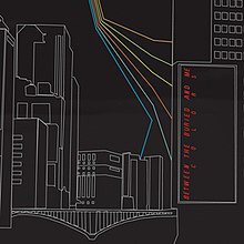
There's some small things I would like to edit on this token. I'm not 100% happy about the divisions, they're too grouped together and not sharp enough. The colours could be a little more vivid. Other than that, I thought it was one of my strongest propositions. Hope to see more tokens with different shapes in the future.


The competition was especially very strong with this token. Spitfire and KrazyKitsune made awesome entries so I'm wasn't sure making it to the poll.
This is the token that I put the most time on and I'm really happy about the end result. All made with MS Paint except for the transparency. Shootout to SK8R43 that inspired me.


Here's a second version made for Crazyjayde. I'm having a hard time chosing which is my favourite, I like them both!


What's your favourite?


-----------

Now gonna respond to some people :

Quote:
Originally Posted by Silvuh
Really happy you took the time writing that.
For R176, yeah, it wasn't intended to be sad. I wasn't expecting to create a "lion king father in the sky" impression on the judges. ^^ I should have questionned myself on the placement of the cat.
For Nothing's Gonna Stop Me, I think Xenorosth's entry could be better in bright green and it would be pretty simple to change the colours. I don't know if this would be allowed now the poll ended.

Quote:
Originally Posted by TC_Halogen View Post
Congrats on winning the TGWP token, KrazyKitsune -- I was really hoping to see that one pull out, haha.
100% victory, that's impressive. Too bad he didn't made more entries, because that token is superb. Definitely one of the hardest choices.

Quote:
Originally Posted by _.Spitfire._ View Post
Please use noname's token for the earth blew up, as it's a much more interesting idea lol
I wouldn't be against this but I think it's unfair to the people who voted for you.
noname219 is offline   Reply With Quote
Old 01-21-2013, 05:41 PM   #22
Xenorosth
FFR Player
FFR Veteran
 
Xenorosth's Avatar
 
Join Date: Sep 2009
Posts: 224
Default Re: FFR Token Image Contest: FULL RESULTS!

Like this?

Would have better to invert the colors on White Walls.

Last edited by Xenorosth; 01-21-2013 at 05:46 PM..
Xenorosth is offline   Reply With Quote
Old 01-21-2013, 05:57 PM   #23
noname219
FFR Wiki Admin
Wiki Administrator
Retired StaffFFR Veteran
 
noname219's Avatar
 
Join Date: May 2007
Location: Quebec, Canada
Age: 33
Posts: 1,694
Send a message via Skype™ to noname219
Default Re: FFR Token Image Contest: FULL RESULTS!

Quote:
Originally Posted by Xenorosth View Post
Like this?

Would have better to invert the colors on White Walls.
That's cool, I would try to keep the outline of the hand white to have more contrast between the background and the foreground.

And for White Walls, a "white wall" would have probably gave me more votes. But, what was intended, was to make something radically different than Jake/Zephei's token. I wanted to try an alternative to the "white" White Walls.
noname219 is offline   Reply With Quote
Old 01-21-2013, 07:53 PM   #24
Nullifidian
¯\_(ツ)_/¯
Retired StaffFFR Simfile AuthorFFR Veteran
 
Nullifidian's Avatar
 
Join Date: Sep 2007
Age: 34
Posts: 1,837
Default Re: FFR Token Image Contest: FULL RESULTS!

Quote:
Originally Posted by noname219 View Post
That's cool, I would try to keep the outline of the hand white to have more contrast between the background and the foreground.
That's not a good idea at all to create contrast
__________________
Nullifidian is offline   Reply With Quote
Old 01-21-2013, 08:10 PM   #25
noname219
FFR Wiki Admin
Wiki Administrator
Retired StaffFFR Veteran
 
noname219's Avatar
 
Join Date: May 2007
Location: Quebec, Canada
Age: 33
Posts: 1,694
Send a message via Skype™ to noname219
Default Re: FFR Token Image Contest: FULL RESULTS!

Quote:
Originally Posted by _.Spitfire._ View Post
That's not a good idea at all to create contrast
I disagree, espcially for such a small piece. Good contrast makes tokens more striking to the eye and it catches the attention. White was an exemple, but it could be red (complementary) or yellow.
Why do you think it is not a good thing?
noname219 is offline   Reply With Quote
Old 01-21-2013, 08:17 PM   #26
Nullifidian
¯\_(ツ)_/¯
Retired StaffFFR Simfile AuthorFFR Veteran
 
Nullifidian's Avatar
 
Join Date: Sep 2007
Age: 34
Posts: 1,837
Default Re: FFR Token Image Contest: FULL RESULTS!

because there are better ways to create contrast than pure white (like changes in saturation and value, or use of complementary contrasts like you said, although red and green aren't exactly the prettiest of contrasts and easy to mess up). Pure white is out of place if it's not used throughout in various other elements, and one outline in white doesn't cut it. It'll make the hand feel as if it's randomly placed instead of part of the design.
I'm also generally opposed to using pure black and pure white because of how it's (almost) never there in real life. What you perceive as white/black is hardly ever really white/black. Doesn't mean you can't use black or white though because they do happen sometimes in real life but very rarely.

Contrast itself is fine and obviously necessary for tokens (and many other things), but you don't need to go to the extreme end of a color/value/hue spectrum to create contrast.
__________________

Last edited by Nullifidian; 01-21-2013 at 08:22 PM..
Nullifidian is offline   Reply With Quote
Old 01-21-2013, 08:22 PM   #27
noname219
FFR Wiki Admin
Wiki Administrator
Retired StaffFFR Veteran
 
noname219's Avatar
 
Join Date: May 2007
Location: Quebec, Canada
Age: 33
Posts: 1,694
Send a message via Skype™ to noname219
Default Re: FFR Token Image Contest: FULL RESULTS!

Quote:
Originally Posted by _.Spitfire._ View Post
because there are better ways to create contrast than pure white (like changes in saturation and value, or use of complementary contrasts like you said, although red and green aren't exactly the prettiest of contrasts and easy to mess up). Pure white is out of place if it's not used throughout in various other elements, and one outline in white doesn't cut it. It'll make the hand feel as if it's randomly placed instead of part of the design.
I'm also generally opposed to using pure black and pure white because of how it's (almost) never there in real life. What you perceive as white/black is hardly ever really white/black.

Contrast itself is fine and obviously necessary for tokens, but you don't need to go to the extreme end of a color/value/hue spectrum to create contrast.
Fair enough, I thought you said contrast in general.
And the contrast has to be relevant to the song. Since it's all electronic, unnatural colours can be used. I wouldn't say so if it was a rock or classical piece for example.
noname219 is offline   Reply With Quote
Old 01-21-2013, 08:24 PM   #28
Nullifidian
¯\_(ツ)_/¯
Retired StaffFFR Simfile AuthorFFR Veteran
 
Nullifidian's Avatar
 
Join Date: Sep 2007
Age: 34
Posts: 1,837
Default Re: FFR Token Image Contest: FULL RESULTS!

Quote:
Originally Posted by noname219 View Post
Fair enough, I thought you said contrast in general.
And the contrast has to be relevant to the song. Since it's all electronic, unnatural colours can be used. I wouldn't say so if it was a rock or classical piece for example.
Unnatural colors still have to fit together to look appealing lol. The problem with color is that it's not a matter of let's make this red, this blue and this green because then you'll end up with over saturated colors that clash. Color is more intricate than that. Take this for example: whenever you use a lot of red in a painting/graphic/design/whatever, grey or desaturated/hue-shifted versions of green will already start to appear really green so you don't need to go to the outer green spectrum at all to make "green". The same principles still applies for unusual color schemes as well.

edit: here's a good example to support my example:

The blue of the sky in the top picture is the same color as the yellow in the ornaments in the bottom picture
__________________

Last edited by Nullifidian; 01-21-2013 at 08:39 PM..
Nullifidian is offline   Reply With Quote
Old 01-21-2013, 08:39 PM   #29
noname219
FFR Wiki Admin
Wiki Administrator
Retired StaffFFR Veteran
 
noname219's Avatar
 
Join Date: May 2007
Location: Quebec, Canada
Age: 33
Posts: 1,694
Send a message via Skype™ to noname219
Default Re: FFR Token Image Contest: FULL RESULTS!

Quote:
Originally Posted by _.Spitfire._ View Post
Unnatural colors still have to fit together to look appealing lol. The problem with color is that it's not a matter of let's make this red, this blue and this green because then you'll end up with over saturated colors that clash. Color is more intricate than that. Take this for example: whenever you use a lot of red, grey will already start to appear green so you don't need to go to the green spectrum at all to make "green". The same principles still applies for unusual color schemes as well.
I remember that optic effect (I don't know the english name but I know it as "contraste simultané"). It can also mess up your entire piece if you don't know how to work with that.
noname219 is offline   Reply With Quote
Old 01-21-2013, 08:41 PM   #30
Nullifidian
¯\_(ツ)_/¯
Retired StaffFFR Simfile AuthorFFR Veteran
 
Nullifidian's Avatar
 
Join Date: Sep 2007
Age: 34
Posts: 1,837
Default Re: FFR Token Image Contest: FULL RESULTS!

Yeah simultaneous contrast

When used properly, it yields far more appealing results than simple black and white. Incorrect use of black and white yields naive results.
but even simultaneous contrast aside, you can do a lot with color harmonies etc as well, and still have a graphic stand out.
__________________

Last edited by Nullifidian; 01-21-2013 at 08:49 PM..
Nullifidian is offline   Reply With Quote
Old 01-21-2013, 09:03 PM   #31
Zephei
The Supreme Bean
D7 Elite KeysmasherFFR Veteran
 
Zephei's Avatar
 
Join Date: Nov 2011
Location: Iowa, Earth
Age: 26
Posts: 297
Send a message via Skype™ to Zephei
Default Re: FFR Token Image Contest: FULL RESULTS!

I think I'll post all my entries too, if anyone wants to critique them. I'm actually pretty new to this kind of thing, so critique is welcomed.


I liked the idea of making a Kirlian-photograph-style image for the backing of the token. The shores were difficult to depict as a Kirlian photograph, so I settled with a kind of tranquil scene with a palm tree and an island. The colours reflect the mood as best I could make.


Took a pretty literal approach to this one. I actually meant for this to look like ink splattered on a wall, but I liked the outcome.


Not a lot to say about this one. I generated what looked like a planet exploding and embellished it.


Oops. Was supposed to be happy hardcore. Would've coloured it appropriately, but I had some other hardcore track playing in my head and was convinced it was R176.


I struggled a bit here. Not exactly sure what I was thinking.


I screwed around with some filters, and this happened.
__________________
Expert AAAs: 22
Master AAAs: 11
Guru AAAs: 9

Zephei is offline   Reply With Quote
Old 01-22-2013, 04:59 AM   #32
popsicle_3000
Legendary Noob
FFR Simfile AuthorFFR Veteran
 
popsicle_3000's Avatar
 
Join Date: Sep 2005
Age: 38
Posts: 4,641
Send a message via Skype™ to popsicle_3000
Default Re: FFR Token Image Contest: FULL RESULTS!

wow, noname's S is awesome.
__________________

Quote:
Originally Posted by One Winged Angel View Post
39,000 popsicles pro bg blue note arrow slayer whoa damn..
Quote:
Originally Posted by Xx{Midnight}xX View Post
one way to stream them all
Quote:
Originally Posted by Xiz View Post
Right after sex, it skillboosted me by +10 levels from like a 35-45 about. (Which then 15 min's later I got really tired and couldn't play anymore)

But then my lady friend got pissed off I was playing FFR instead of playing her. Then for the rest of the night she played the 'Only want me for my body' card and I didn't get to sleep with blankets that night.
Quote:
Originally Posted by thesunfan View Post
replacing ifitypedhisnameaslargeashisnamesuggests,iwouldgetbanned with theelongatedaustrocanadian3000 (pop).
Quote:
Originally Posted by reuben_tate View Post
Title: Popsicle Three

Thousand the farthest
He's gone in an official
Whoop hip hip hooray!
Quote:
Originally Posted by U.N. Owen View Post
kjwkjw: "oh my god, Tosh. Post that in the thread."

@popsicle_3000:
Danger incoming
The popsicles are melting
Three thousand of them
Quote:
Originally Posted by Wayward Vagabond View Post
you got to ease the topic into some conversation and let it go from there

dynam0: man friend that was an intense sm session right?
friend: haha yeah you really nailed those patterns
dynam0: yeah man kind of like how gay dudes nail other gay dudes in the ass!
friend: hey bro can i tell you something
dynam0 yeah man whats up?
friend: hypothetically speaking would you care if i was bisexual or maybe even gay?
dynam0: bro we shower together after sm sessions all the time and i'll still shower with you even if you are gay or w/e thats your thing just dont try to ram my ass HAHAHA
friend: thanks man
dynam0: no problem man
Quote:
Originally Posted by One Winged Angel View Post
pop takin' time out of playing irl Trauma Center to check in on his fiffer buds (mm)
Quote:
Originally Posted by Xiz View Post
Well, Popsicle won every award this year so it was canceled.
popsicle_3000 is offline   Reply With Quote
Old 01-24-2013, 10:18 PM   #33
noname219
FFR Wiki Admin
Wiki Administrator
Retired StaffFFR Veteran
 
noname219's Avatar
 
Join Date: May 2007
Location: Quebec, Canada
Age: 33
Posts: 1,694
Send a message via Skype™ to noname219
Default Re: FFR Token Image Contest: FULL RESULTS!

So...

What Megaman token won 3rd place ?

This one ?
Or this one ?

Thanks popsicle btw!
noname219 is offline   Reply With Quote
Old 01-24-2013, 10:21 PM   #34
Netjet!
Sic itur ad astra
Retired StaffFFR Simfile AuthorFFR Veteran
 
Netjet!'s Avatar
 
Join Date: Jan 2008
Location: Ottawa, Canada
Age: 30
Posts: 4,700
Send a message via AIM to Netjet! Send a message via Skype™ to Netjet!
Default Re: FFR Token Image Contest: FULL RESULTS!

Oops, the second one did!

e: I'll see if I can post the full token image results for you guys, but it'll be in a little bit because tomorrow is my birthday! ;D
__________________
RIP Steve Van Ness <3

Last edited by Netjet!; 01-24-2013 at 10:22 PM.. Reason: added
Netjet! is offline   Reply With Quote
Reply


Currently Active Users Viewing This Thread: 1 (0 members and 1 guests)
 

Posting Rules
You may not post new threads
You may not post replies
You may not post attachments
You may not edit your posts

BB code is On
Smilies are On
[IMG] code is On
HTML code is Off

Forum Jump


All times are GMT -5. The time now is 03:45 PM.


Powered by vBulletin® Version 3.8.1
Copyright ©2000 - 2024, Jelsoft Enterprises Ltd.
Copyright FlashFlashRevolution